HB1 Langkawi love to meet clients but sometimes they are based a long way from our studios in LKuala Lumpur. By using the internet and conference telephone calls, this is not a problem. We offer a journey that ends with a great design.
![]()
Modeled and animated in 3D Max software AV solutions is a good representation of what happens when creativity meets with technology. The AV Solution designhas proved to be popular with their customers.
![]()
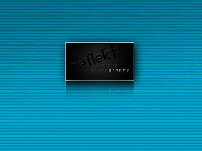
They needed their logo to be simple, bold and powerful. We combined the lettering into one simple but identifiable symbol, which is powerful enough for the studio to use by itself, or as part of identity.
![]()
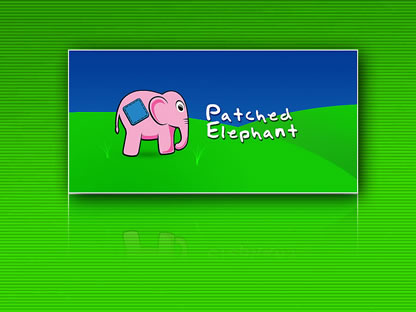
The key to the Patched Elephant brand is that it is designed to appeal to a wide age range. The logo had to be eye catching but also fun and not too heavy (hard work for an elephant!). All items sold through the business revolve around children replica patek philippe nautilus watches so for inspiration Patched Elephant supplied some children's drawings. We took those drawings and refined the various ideas into the new cartoon-style logo and colourful branding.
![]()
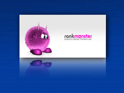
The rank monster or "Fuzz" to his friends was developed to highlight their search engine marketing services. It was decided that we should create a fun character that makes light of the often dull subject of optimisation and link building. He is now set to be utilised further with Search Engine Marketing services and support literature.
![]()
Media Intel's logo and branding seemed dated and needing to be reengineered. We decided not to move far from their existing logo. By adding contrast between Media Intels symbol and text the brand stands out far more than it did previously. The new logo inspires trust and has given new life to their marketing material.
![]()
The new logo design and corporate colours were effective in drawing in additional custom and also strengthening the corporate image with existing clients. The lag time between launching the new logo and achieving results was significantly reduced by the circulation of stationery and printed materials among customers.
![]()
Bogies' were keen not to influence us during the design of their logo and allowed us free reign over its design. When we researched the haulage industry we spotted a trend in robust and bulky looking logos. But, with Bogies emphasis on speed, reliability and efficiency we knew we could stand out from the crowd with a sleeker design to their competitors. Bogies logo is now the most identifiable logo in their industry.
![]()
When Blue came to us they already had a logo and a website, but neither were very appealing so they wanted an immediate rebrand. Blue Financial's almost aquatic logo started life in 3D, which allowed us to quickly find the angle Blue wanted for their jigsaw piece. The logo was then touched up in Photoshop for their website before replicating it in Illustrator for print.
![]()
Prigel paper wanted to stand out from other paper merchants. We implemented this origami design to show their diversity in paper colours which has proved very successful.
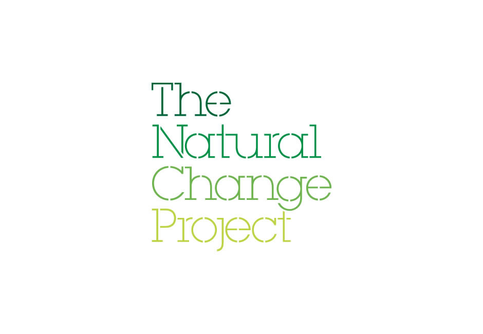
What's in a name? Well, everything. We work with clients big and small, well-established and on the brink of greatness to develop memorable and manageable identities and logotypes. Here are just one of our favourites from the archives.
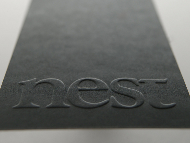
We articulated the companyୡin aim and generated a memorable strapline ng the most of your homeץ then developed a typographic marque with a bespoke, contemporary twist that conveys the high quality of service provided. The business cards feature a blind emboss and are printed on a tactile paper stock.
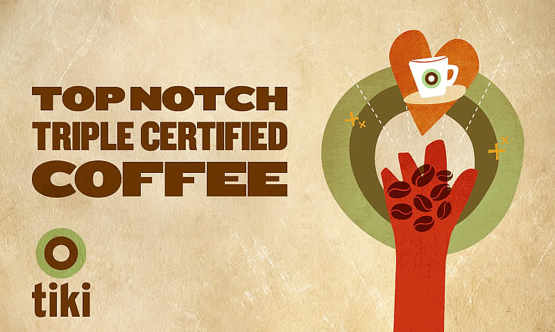
The Tiki brand needed a bit of a refresh so we created a new visual identity, developing and bringing together a new brand framework including illustrations typefaces, and colours that have been applied across cups, menus etc. and interior spaces.